
Rifflandia Y2
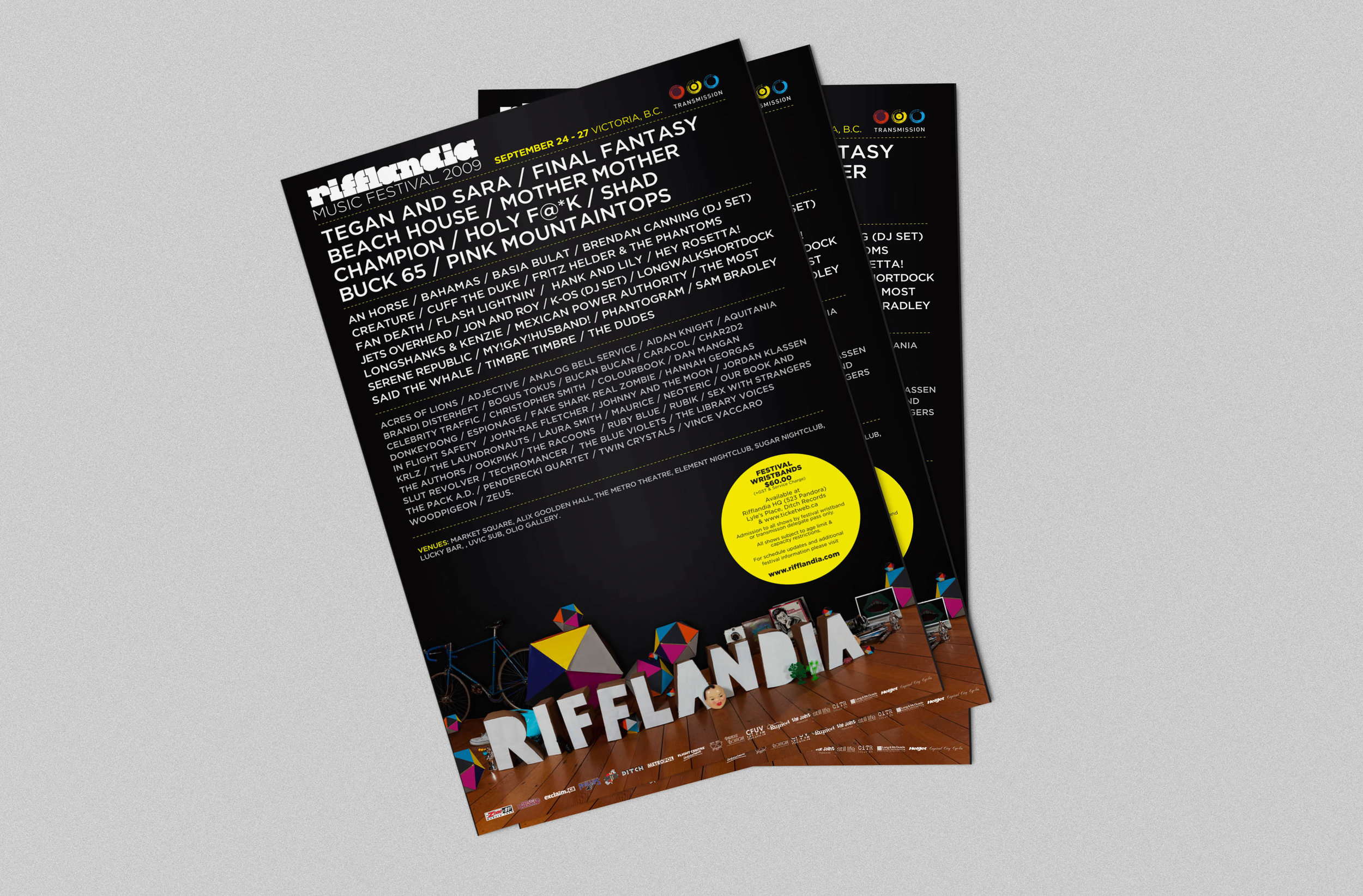
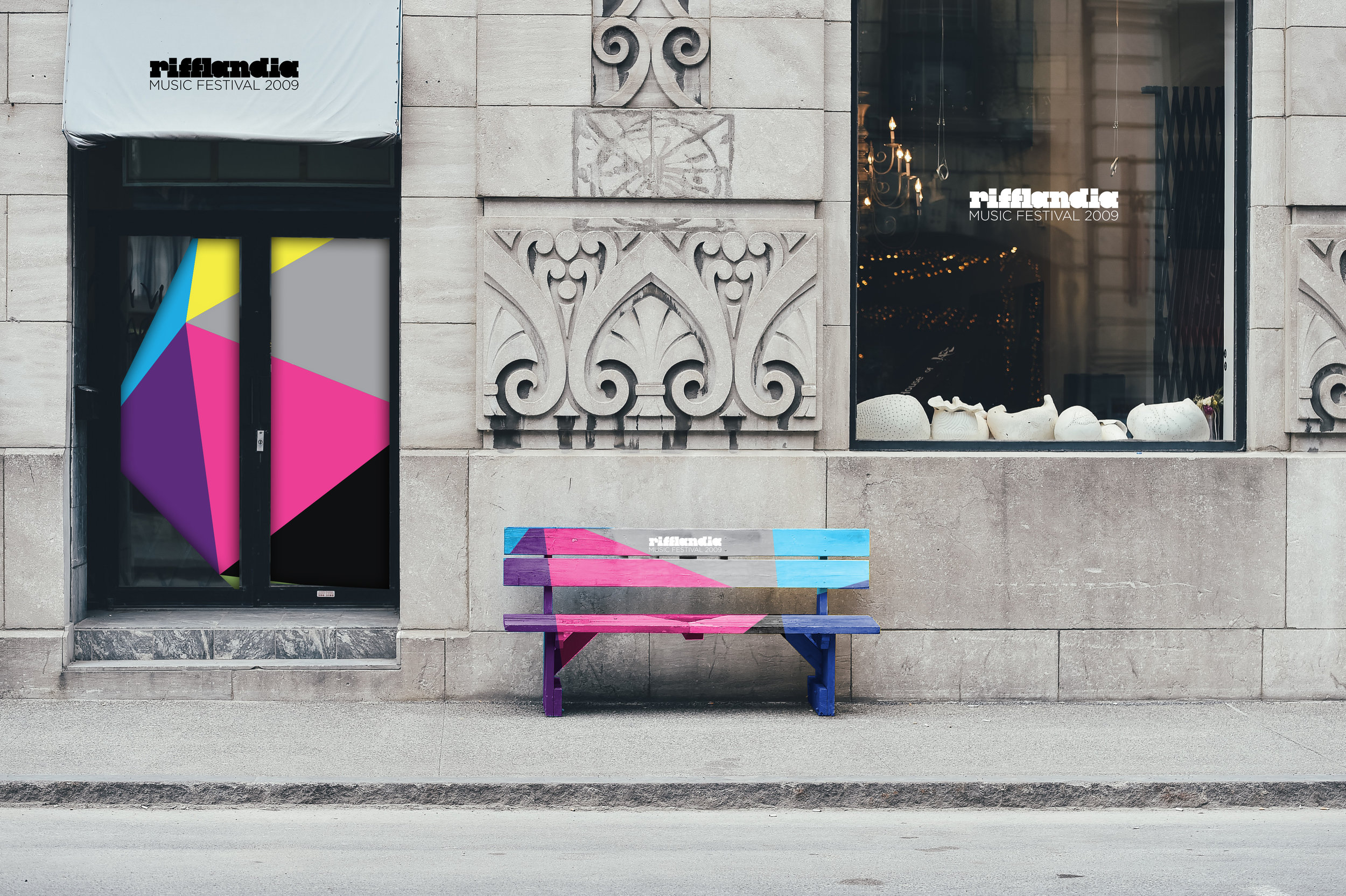
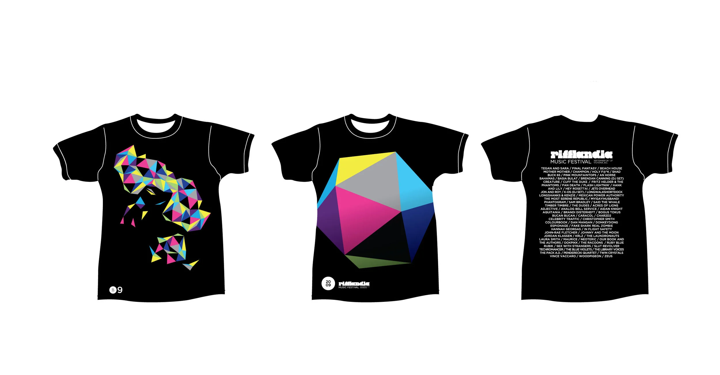
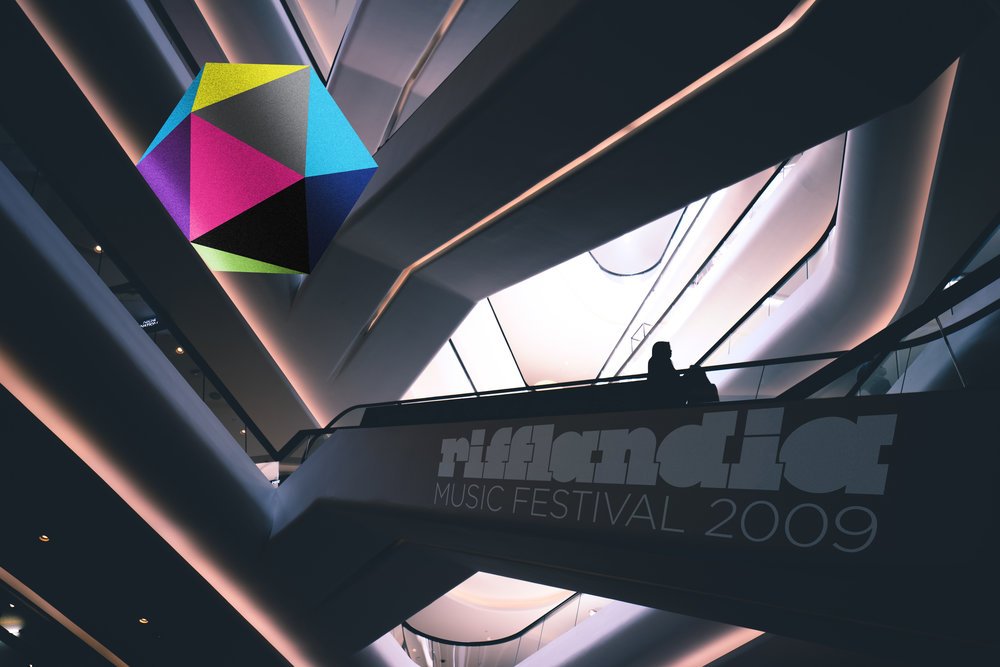
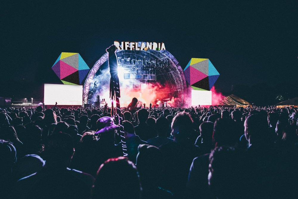
Once upon a time a big festival came to the small, picture-perfect city of Victoria, British Columbia. Rifflandia Music Festival made quite an impression in its inaugural year, and it’s still going strong today. We created the festival’s brand identity and related collateral, including the introduction of what would become the festival’s annual magazine. The festival was a musical adventure unique to Victoria’s music-lovers. We wanted to play on this when developing the brand, creating not just a logo, but a visual cue that spoke to the experience. The multi-coloured icosahedron was both powerful and impactful yet ambiguous enough to lend itself to a variety of applications. Much like the new festival it represented, it defied simple description. Carrying our inspiration of geometry throughout, we used experiential and spatial design to transport Victoria’s festival-goers somewhere they’d never been before.

Once upon a time a big festival came to the small, picture-perfect city of Victoria, British Columbia. Rifflandia Music Festival made quite an impression in its inaugural year, and it’s still going strong today. We created the festival’s brand identity and related collateral, including the introduction of what would become the festival’s annual magazine. The festival was a musical adventure unique to Victoria’s music-lovers. We wanted to play on this when developing the brand, creating not just a logo, but a visual cue that spoke to the experience. The multi-coloured icosahedron was both powerful and impactful yet ambiguous enough to lend itself to a variety of applications. Much like the new festival it represented, it defied simple description. Carrying our inspiration of geometry throughout, we used experiential and spatial design to transport Victoria’s festival-goers somewhere they’d never been before.




CO-CD. Brandon Velestuk

RIFFLANDIA Y2
Once upon a time a big festival came to the small, picture-perfect city of Victoria, British Columbia.
Rifflandia Music Festival made quite an impression in its inaugural year, and it’s still going strong today.
We created the festival’s brand identity and related collateral, including the introduction of what would become the festival’s annual magazine.
The festival was a musical adventure unique to Victoria’s music-lovers. We wanted to play on this when developing the brand,
creating not just a logo, but a visual cue that spoke to the experience. The multi-coloured icosahedron was both powerful
and impactful yet ambiguous enough to lend itself to a variety of applications. Much like the new festival it represented,
it defied simple description. Carrying our inspiration of geometry throughout, we used experiential and spatial
design to transport Victoria’s festival-goers somewhere they’d never been before.




RIFFLANDABRAU
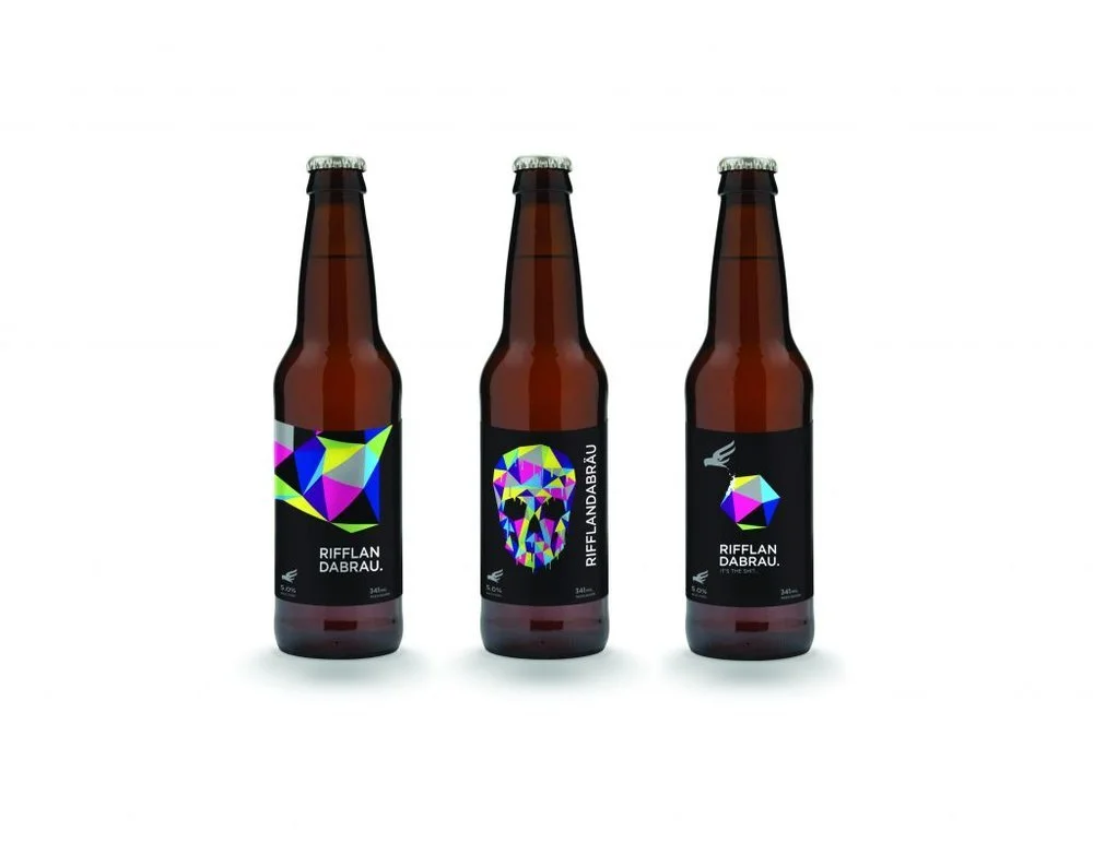
The festival even had it’s own beer! **
Agency: Scum Creative Labs
Creative Direction: Christopher Bradford & Brandon Velestuk
Additional Skull Beer bottle design: Shawn O’Keefe**
Photography: Doug Harrington
Printers: Transcontinental
